Building My Middleman Blog
Building my own blog from scratch was a lot more work than I realized. There were so many things that I did not know how to do, and as simple as it sounded to me, “Oh hey, let’s just put up a basic static site using Middleman” it really did not turn out that way.
When you build a blog with a framework like Wordpress things can be very simple. A lot of stuff is done for you, and you have a wide range of plugins which you can install to take care of more of the details, plus themes will handle the styling on your page.
My goals for the website were:
- Use the process as a learning experience to become familiar with design.
- Have a decent landing page with links for people to learn about me.
- Blog would be a clean design with easy navigation for finding articles.
- Be a place to showcase any projects I work on.
Setup Hell
At first, I almost quit before I started. I hit some major roadblocks, such as an overall lack of in depth setup, and I am just a noob at building websites in general so I wasn’t sure what all I needed.
Hosting
There are a ton of options for hosting and just as many opinions. After doing a bit of research however, and realizing that I hate spending money I realized that Github Pages was the perfect fit for a static site. All I had to do was create a CNAME file, and change some settings for my Domain host and I was all set. Github has a great walk through as well.
Deploy
For deploying, I use the middleman-deploy gem which takes care of most of the work for me.
Syntax Highlighting and Markdown to HTML generation
Getting code blocks to render properly, and correct Markdown generation was a NIGHTMARE. This was a huge roadblock for a while. I copied an example markdown file from Github to test things at first.
I eventually settled on using Redcarpet and the middleman-syntax gem. As for code block styling, it was impossible for me to debug how to generate a css with Rogue, so I eventually found a css file that I could copy paste over. This is what my config looks like.
#config.rb
set :markdown_engine, :redcarpet
set :markdown, :fenced_code_blocks => true,
               :tables => true,
               :smartypants => true,
               :autolink => true,
               :highlight => true,
               :with_toc_data => true

activate :syntax
I copied the solarized-light css file over into a highlights/ directory. I did
make a few minor tweaks to it also. It looks pretty dirty, but it gets the job
done.
Designing the site
I could have gone with a css framework such as Bootstrap or Foundation, but I wanted as semantically clean of a design as I could find and since I was already using Middleman, I decided to go with the Bourbon / Neat family. This added yet another layer of complexity, as it meant I’d have to learn another thing which was completely unfamiliar, and pretty much do all of the styling from scratch.
To get the most basic setup going, I was able to follow along with the Thoughtbot setup article here: Styling a Middleman blog with Bourbon, Neat and Bitters
I had absolutely no idea where to go next from there, in terms of designing everything. I am totally logic minded, and have very little experience with visual design.
To summarize how I got to a workable design, these are the steps that I took:
- Created an “Inspiration” folder, and put any blog designs I found in there.
- Read through the Bourbon docs a few times to get a feel of how it worked.
- Completed the Sass fundamentals trail on Upcase to get familiar with Sass
- Followed the Upcase - Design for Developers course. This really helped me put things in perspective and get at least a plan for moving forward.
That’s really it! I’ll post updates below of how the design updates are coming along.
Feb 26 Iteration
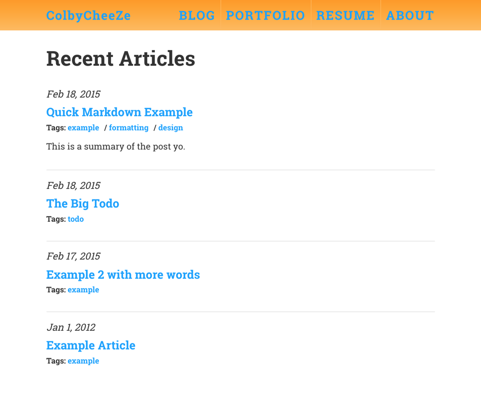
Would you believe me if I told you it took me 2 hours just to get that top Nav set up? I kept running into positioning problems. The main thing was setting the Nav height specifically, instead of letting the links determine it. The rest was just floats!

Feb 28 Iteration
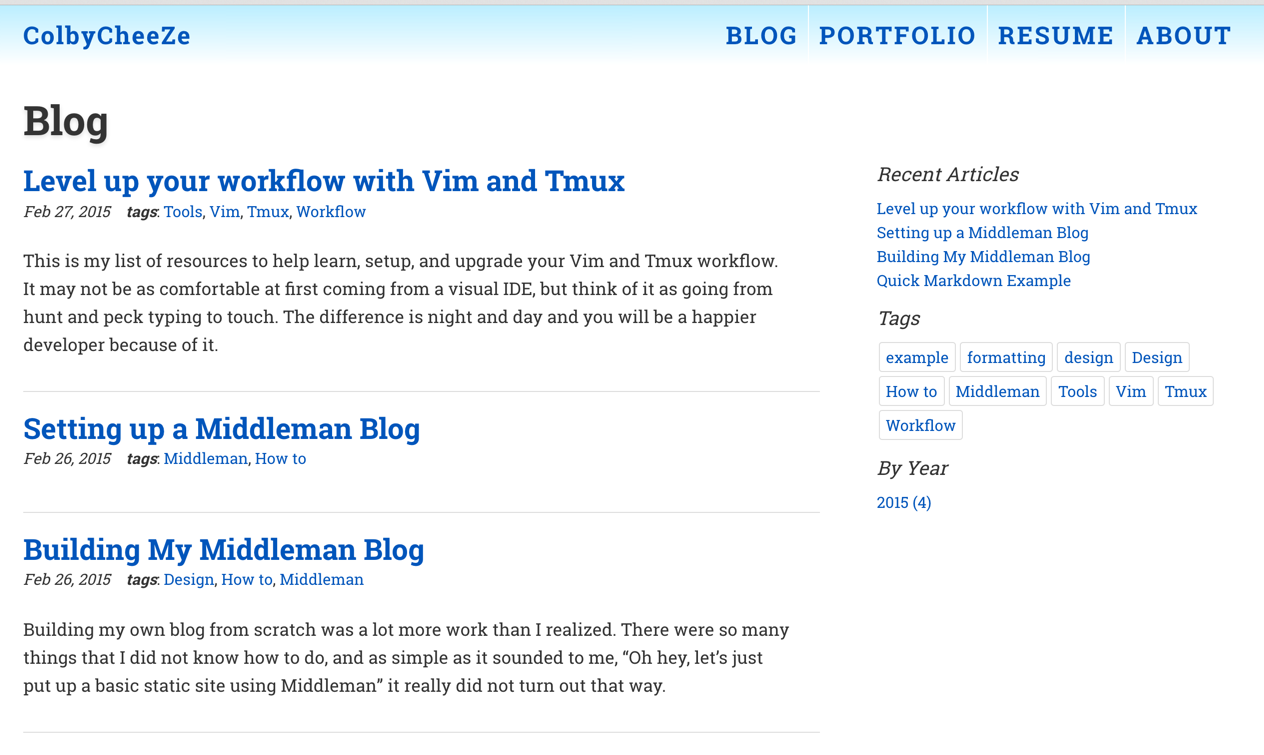
I’ve been working on various things, and getting the spacing down. Also I changed out of that odd orange color. The framing is completed, and I gave the tags a neat little box around them.

March 7 Iteration
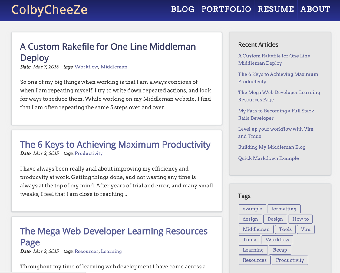
We are coming along! I’ve redone some colors, typography, and got things spaced and sectioned out into pretty little rectangles. I still hate the header, and I think there are a few more tweaks to do as well but I am getting there.
